Categories
Kitchen

Cow Kitchen Decor

I remember the afternoon my youngest dragged a squashed cookie into the living room and declared it a new pet, while my neighbor waved from her porch as her golden retriever chased leaves down the street. With two kids between eight and twelve, our days blur into school drop-offs, snack negotiations, and chore charts stuck to the fridge with magnets. Those little routines make our house feel like a small, lived-in storybook, and I love adding touches that make it feel warm and personal. When I plan a refresh, I often flip through home projects or save a pin about curb appeal, like the time I bookmarked fall exterior decor ideas, then translate that cozy color palette indoors. Lately, I’ve been drawn to playful farmhouse motifs for the kitchen—ways to weave charm into daily life without sacrificing function or family comfort.

1. Vintage Cow Art Gallery

A wall of framed cow prints brings instant personality without shouting. Start with a mix of vintage sketches, reproduction farm signs, and one family photo in a rustic frame to keep it personal. Visually it anchors the space with repetition and texture; emotionally it taps into nostalgia, reminding me of visits to my grandparents’ farmhouse and Sunday dinners that lingered long after the plates were cleared. To apply this at home, choose a small wall near the breakfast nook and hang frames at child-friendly heights so the kids can point out favorites. Rotate prints seasonally or let your eight-year-old create a painted panel to add a sense of ownership. This approach is a simple interior styling tip that layers history and heart, and it plays well with neutral walls and wooden shelves so the art is the star.

2. Cow-Print Textiles for Comfort and Character

Swapping out textiles is an easy way to introduce a cow motif that feels cozy rather than kitschy. Think tea towels, seat cushions, a small runner, or a dishcloth in subtle black-and-white patterning. Textiles soften the room acoustically when kids practice piano or when neighbors drop by for coffee, creating a lived-in comfort. I look for washable fabrics that can handle spills from after-school crafts and weekend baking sessions. For visual cohesion, pair patterned pieces with solid neutrals and a few leather or woven accents to keep the overall look grounded. Practical application is simple: layer a patterned runner on the island, fold coordinating towels over the oven handle, and swap cushion covers when you want a bolder statement. These interior styling tips deliver personality while keeping cleanup and family life front of mind.

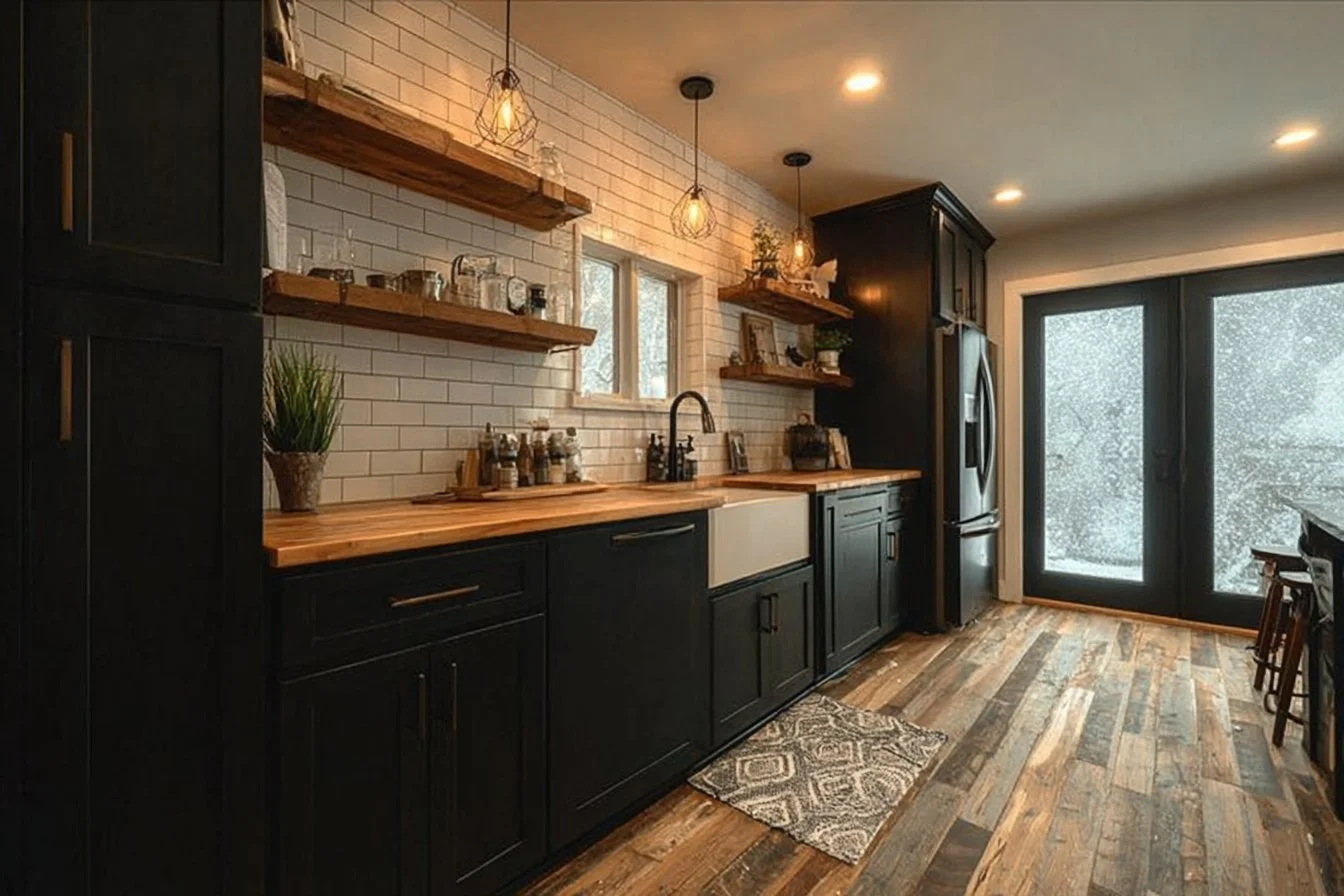
3. Functional Cow-Themed Kitchenware on Open Shelves

Open shelving is a favorite for showing off things you actually use, and cow-themed mugs, enamel pitchers, or milk bottles feel authentic on display. The visual benefit is immediate—everyday items become decor pieces, making the kitchen feel curated rather than cluttered. Emotionally, it sends a cozy message that our home is for living in. Start by arranging a few curated items at eye level and keeping everyday pieces within reach for the kids. Mix textures—ceramic with metal—for contrast, and rotate items from a cupboard for different moods. If you enjoy themed table settings for family dinners or when friends come over, I sometimes borrow ideas from curated tablescapes like the creative touches found in valentine table decorations, adapting color palettes to the kitchen’s tone. This keeps decorating inspiration practical and rooted in daily use.

4. A Cow Chalkboard for Family Notes and Recipes

A framed chalkboard with cow silhouette stencils becomes both a decorative focal point and a functional family command center. Hang it near the door where permission slips are signed and snack lists appear, or by the stove where the kids love to scribble the recipe steps. Visually it adds contrast and a handmade feel; emotionally it becomes part of the household rhythm—notes about piano practice, reminders for soccer, or a silly doodle from an eleven-year-old that brightens a morning. To implement, pick a durable board and a few colorful chalks, then allot a small area for rotating messages and another for grocery needs. This small practice blends decorating inspiration with everyday utility, encouraging kids to write and helping neighbors who drop off packages to see the week’s plan at a glance.

5. Seasonal Centerpieces and Farmhouse Greenery

A simple centerpiece with faux or potted herbs, a small milk can, and a cow-themed ceramic accent anchors the dining table without taking over. Greenery brings life and a fresh scent during homework hour, while a milk can adds that farmhouse authenticity. Emotionally, a living arrangement signals care and invites everyone to gather for meals. To use this idea at home, choose plants that tolerate brief neglect, such as rosemary or succulents, and tuck an accent piece into a wooden tray for easy removal when kids need the table for craft projects. If you like holiday touches, mix in ideas from outdoor DIY projects like easy DIY Christmas decorations outside for inspiration on natural elements and texture, then translate those color stories to your indoor centerpiece. This makes your kitchen feel seasonal but still family-friendly.

6. Thrifted Finds and Upcycled Cow Pieces

Hunting at thrift stores or flea markets is half the fun and a great way to score unique cow-themed items that tell a story. A reclaimed cutting board with a painted cow, or a tin sign can be given a new life on a shelf or propped against a backsplash. Visually, these pieces add patina and authenticity; emotionally, they become conversation starters about weekend adventures with the kids or the neighbor who taught you how to refinish wood. To apply this, set a small budget and involve the kids in choosing something small they connect with—an activity that turns decorating into a family memory. Finish with a light clean and a protective coat when needed, then style it alongside modern accents to balance nostalgia with current interior styling tips.

Conclusion

If you want a kitchen that feels both playful and lived-in, try blending a few cow-themed touches with practical pieces you already use each day. Save a pin, take a thrift-hunting Saturday with the kids, or swap out a few textiles to test what resonates with your family’s routine. For one-stop shopping to explore cow-themed finds and spark decorating inspiration, check out this collection of cow-themed kitchen finds on Amazon and see what might fit into your own cozy, everyday kitchen.

Categories
Kitchen

Whole-Home Color Stories for Cozy, Modern Living

I used to stand at my kitchen counter with a mug cooling in my hands, watching my two kids, ages 8 and 11, race the mail carrier down the sidewalk while Mrs. Hernandez next door waved from her garden. Weekdays blur with school drop-offs, homework battles and weekend soccer, but the little moments—the way sunlight spills into our living room at 4 p.m., the way a favorite chair still holds the imprint of my son’s afternoon reading nook—are what make a house feel like ours. When I began rethinking paint for every room, I leaned into palettes that could handle sticky fingers, late-night homework, and cozy family movie nights. If you want approachable, whole-house color advice that fits busy family life, my round-up of curated combinations and practical tips brings together the calm and the current. For more detailed color pairing ideas, I often revisit trusted guides like color harmony palettes for fresh inspiration.

1. A Calm Neutral Base That Unifies the Home

Choosing a warm neutral as your home’s anchor creates visual flow from room to room, which helps tired parents feel instantly more relaxed. Neutrals like soft greige, warm ivory, or a muted taupe read differently in morning light and evening lamplight, so they adapt to family routines. Visually, a single neutral base reduces visual friction between furniture and toys, and emotionally it gives everyone a warm backdrop for shared moments like puzzle nights or birthday decorations. Apply this by painting hallways, living rooms and open-plan spaces the same hue and then layering color with textiles and accent furniture. For example, paint trim one shade lighter than walls to add polish without fuss. This approach supports interior styling tips that prioritize cohesion while still allowing each bedroom or playroom to show personality through removable accents and kid-proof fabrics.

2. Warm-White Kitchens with Pops of Personality

A warm white kitchen feels bright and timeless, yet it’s forgiving enough for the daily mess of lunches and homework projects. Warm whites create a welcoming, sunlit feel that neighbors compliment when they pop over with cookies. Paint cabinetry or upper walls in a slightly creamy white, then add depth with a darker island or pantry wall in a muted blue or green. This contrast gives the room a focal point and makes cleanup easier when marks show up on lower cabinetry. For actionable inspiration on kitchen whites and coordinating accents, I looked at curated ideas that highlight how a warm white kitchen can anchor your whole home, like the guide on timeless warm white kitchen ideas. This strategy blends classic styling with practical choices for families who need beauty and durability.

3. Cozy Moody Accents for Living and Dining Areas

Adding a moody accent wall or painted built-in can make a room feel intentional and grown-up while still family friendly. Deep navy, charcoal, or forest green bring warmth and create a backdrop for framed family photos, lively conversations and holiday gatherings. The trick is balance: keep large surfaces lighter and reserve richer tones for one wall, a fireplace surround, or shelving backs. Emotionally these colors feel comforting at the end of a long school day, and visually they make light furniture pop. Practical application: choose semi-gloss on trim and satin on walls for easy wiping, and coordinate soft rugs and washable slipcovers for sofas. This gives parents the elegance they crave with sensible finishes that handle spilled juice and crayon marks with less stress.

4. Soft Pastels to Make Bedrooms Calm and Cheerful

Bedrooms for kids and parents alike can benefit from muted pastels rather than sugary brights. Soft sage, dusty rose or pale aqua create restful retreats that still feel playful when layered with colorful bedding and art. Psychologically, gentler tones support sleep and calm after active days of sports and screen time. To apply this: paint the walls in a single pastel tone and add contrast with white trim and natural wood furniture. Let kids pick removable decals or framed prints so their space stays fresh as they grow. These tones also translate well into guest rooms, making your home versatile when relatives visit and giving you decorating inspiration that keeps both function and style in mind.

5. Coastal Calm for Relaxed Family Gathering Spaces

If your family loves a breezy, lived-in vibe, a coastal-inspired palette is surprisingly adaptable inland too. Think soft sea-glass greens, sandy beiges and driftwood greys that reflect natural textures and casual living. This works visually by creating a layered, calming scheme that hides minor scuffs and always looks intentional during impromptu playdates. Emotionally, the palette invites slower moments—reading on the porch with a blanket, baking with kids, or hosting an after-school snack. Apply it by painting a playroom or family room in a soft green and anchoring seating with neutral slipcovers and woven baskets for toys. For those who want a full coastal mood without overcommitting, this palette offers easy swaps like throw pillows and wall art that refresh the room between seasons.

6. Monochrome Texture for Modern, Durable Style

A monochrome scheme in layered neutrals—think warm grays and soft whites—feels modern yet comfortable and is ideal for homes with active children. The power of monochrome is texture: woven rugs, matte walls, glossy trim and mixed-metal fixtures create depth so rooms never feel flat. Visually, this allows furniture and meaningful items like children’s artwork to shine. For practical application, select washable paints for lower walls and keep high-impact finishes on trim where wear is expected. Add textured curtains, cork notice boards for school memos, and a sturdy dining table that resists daily chaos. This approach supports interior styling tips that are both aspirational and realistic for families who want a curated look without constant upkeep.

Conclusion

Every family’s rhythm is different, but thoughtful color choices make daily life feel easier and more beautiful. Save or pin these decorating inspiration ideas and try one small change first—like a feature wall or refreshed trim—to see how color can lift routines and create cozy memories. For more curated palettes and professional color pairings to help you plan a whole-house update, check the Color Collections | HGTV Home® by Sherwin-Williams.

Categories
Kitchen

Bold Black Kitchen Designs for Modern Homes

I still laugh when I think about the time my neighbor, Karen, stopped by with muffins and commented that our kitchen looked like it belonged in a magazine. As a mom in my forties with two kids between 8 and 12, most mornings are a blur of backpacks, sports gear, and spilled cereal. Evenings are for homework, dishes, and the tiny rituals that make a house feel like home, like trading stories about the day while stirring a pot. Over the years I’ve learned that a space can be both practical and beautiful, and that the right design choices make daily life feel calmer. That’s why I’ve fallen for moody, modern black touches that hide messes, elevate simple routines, and still welcome sticky little hands. If you love home décor ideas that balance style with real family life, these looks will spark decorating inspiration without getting in the way of your busiest days.

Matte Black Cabinets as a Practical Anchor

Matte black cabinetry makes a bold statement without feeling flashy. Visually, it creates a calm backdrop that hides fingerprints better than high-gloss finishes, which is a lifesaver when kids are learning to help with snacks. Emotionally, it reads as confident and collected, turning everyday tasks into a moment that feels a little more intentional. To apply this at home, pick a single wall of lower cabinets in matte black and pair them with durable butcher block or quartz countertops. Keep everyday dishes and cereal bowls within easy reach for the kids by placing open storage nearby. This approach supports busy routines while offering a chic foundation for interior styling tips like adding warm wood tones or simple white accents to keep the space from feeling too heavy.

Black Island Focus with Warm Pendant Lighting

A black kitchen island anchors family life: it’s where homework happens, lunches are packed, and friends crowd around on weekends. Using a deep black finish on the island draws the eye and frames these moments like little scenes of daily life. Visually, it creates contrast and depth, making the rest of the kitchen feel more expansive. Practically, choose a durable countertop material and rounded edges for safety with younger kids. Add warm-toned pendant lights to soften the black surface and create cozy pools of light for evening chats and late-night dish duty. This setup blends decorating inspiration with function, and it’s an easy way to channel interior styling tips by simply swapping pendant finishes or stool colors as tastes change over the years.

Black Accent Wall with Open Shelving and Tiled Backsplash

An accent wall in matte or satin black instantly modernizes a kitchen without a full remodel. Pairing that wall with open shelving keeps things approachable and homey—place colorful kid-painted mugs or a stack of favorite board games within reach. For added texture and practicality, pair the black wall with a black tile backsplash in a subtle pattern or matte finish; tiles handle splashes and are simple to wipe down after messy cooking nights. Visually this creates layered depth, while emotionally it feels curated, like a lived-in studio. Apply this at home by choosing one wall behind the stove or sink, installing two or three floating shelves, and using them for both storage and styling. It’s a small change that delivers big impact and plenty of real-life utility.

Black Appliances, Brass Hardware, and Classic Contrast

Bringing black appliances into a modern kitchen reads cohesive and intentional, especially when balanced with brass or matte gold hardware. The warmth of brass softens the noir palette and adds a luxurious, approachable touch that resonates during family gatherings. Creatively pair black appliances with crisp white countertops or subway tile to maintain brightness and visual clarity. Functionally, pick finishes that resist smudges and choose hardware that’s ergonomic for little hands trying to help open drawers. This mix of materials offers decorating inspiration by letting you swap small elements—like knobs or drawer pulls—without a full overhaul. It’s a smart way to practice interior styling tips that evolve with your household’s needs.

Warm Wood, Greenery, and Textured Blacks for Comfort

Combining black cabinetry or accents with warm wood and live greenery brings out the best in modern design while remaining family-friendly. Wood tones introduce a comforting, tactile quality that helps black feel warm rather than austere. Add potted herbs or a few easy-care plants on the windowsill to lift the mood and create a sensory connection—herbs are great for kids to smell and pick during meal prep. Textured black finishes, like honed stone or brushed metal, add depth and mask daily wear. When implementing this look, choose one or two wooden elements—open shelves, a breakfast nook bench, or cutting boards—so the space feels balanced. This combo supports both visual interest and the practical flow of busy family life.

Bold Trim, Layered Lighting, and Durable Surfaces

Using black for baseboards, window trim, or a pantry door frames the room and adds architectural drama without a full paint job. Layered lighting—task, ambient, and accent—ensures the darker palette doesn’t swallow natural light, keeping mornings bright for school lunches and homework sessions. For family life, select surfaces that can handle spills and rough use: honed stone, high-quality laminate, or sealed wood. Small choices like adding an easy-to-clean runner by the sink or a soft, stain-resistant rug near the island make everyday living easier. This approach to decorating inspiration and home décor ideas helps you achieve a cohesive, modern room that still accommodates toys, art projects, and the daily rhythm of a busy household.

Conclusion

If these looks have you dreaming of a kitchen that feels both dramatic and livable, save a few ideas and try them in a small corner first—paint a pantry door, swap a light fixture, or add a black island runner. For more curated examples and visual inspiration to guide your next refresh, check out 29 Modern Black Wall Kitchen Ideas for Instant Impact – Mockup Hunt. Come back anytime for more interior styling tips, decorating inspiration, and practical home décor ideas that fit real family life.

Categories
Kitchen

Why Greige Cabinets Make Kitchens Feel Like Home

I used to pour cereal at the counter while signing permission slips, watching the light change across the cabinets and thinking about how our house quietly holds a thousand small routines. Now, with two kids between eight and twelve, mornings are a collage of backpacks, misplaced socks, and neighbor kids knocking to ask if someone can walk home together. My husband and I trade stories over coffee about school projects and the tiny rituals that make a place feel lived in. Those everyday moments taught me that a kitchen should be a comfort zone, not a showroom. When I started freshening up our space, I kept returning to warm, muted tones that calm the chaos and welcome friends. Even the littlest design choices have helped the room feel more like ours. For a dose of postcard charm that influenced my palette, I looked at some postcard-from-Italy kitchen ideas and adapted them to our busy life.

Warm Wood Pairings to Soften Greige

Pairing greige cabinetry with warm wood floors or accents creates an instant sense of comfort. The neutral gray-beige of greige reads as calm and adaptable, and warm woods—like oak or walnut—bring in a natural, lived-in glow that keeps the kitchen from feeling cold. Visually, the grain and warmth add depth; emotionally, the combination feels familiar, like a grandmother’s house updated for today’s family. At home, try wide plank floors or an island countertop with a honey-toned wood insert. In our house, the kids like to perch on the wood island ledge while we prep dinner, and that small interaction makes the material choice feel right. For families, this mix hides wear better than painted white and invites everyday life in without sacrificing style. Small changes like swapping barstools or adding a wooden cutting board can achieve this look affordably.

Two-Tone Cabinets for Visual Interest

A two-tone approach—greige as the main field and a deeper hue on the island or lower cabinets—adds architecture without drama. The contrast gives the eye a place to rest and creates a focal point that grounds family gatherings. It works visually because greige remains neutral, while the darker base commands attention without overpowering. To apply this at home, paint the island in a charcoal or muted navy and keep all perimeter cabinets greige; the result is balanced and practical for hiding fingerprints from little hands. When my neighbor popped over for a playdate, she immediately asked about our island color, which led to swapping school pickups between us. This style also helps with traffic flow: a darker base on the island conceals scuffs from daily use, so your kitchen can stay pretty and functional even with kids around.

Warm Metals and Friendly Hardware Choices

Selecting hardware and fixtures in warm metals like aged brass or soft black gives greige cabinetry personality without fighting the palette. Metals add a tactile, emotional element—brass feels familiar and slightly nostalgic, while matte black reads modern and grounded. Visually, metallics provide sparkle and definition along the edges, so doors and drawers read as carefully considered rather than flat. In practice, swap out builder-grade pulls for simple brass cup pulls on drawers and slim knurled knobs on upper cabinets. My son loves pressing the rounded edges when he helps with baking, and those tactile choices make chores feel like part of the home ritual. Pick finishes that hide fingerprints in high-traffic zones and use a consistent metal for lighting and faucets to tie the room together for a cohesive, family-ready space.

Open Shelves and Family Displays

Integrating open shelving with greige bases softens the room and lets personality show through everyday items. Open shelves display well-loved bowls, school artwork, and a rotating collection of children’s drawings, which makes the kitchen feel alive and reassuring. Visually, the shelves break up cabinetry mass and introduce texture; emotionally, they create connection points where kids can find their favorite mug or a cookie jar. Apply this by installing a couple of staggered shelves near the breakfast nook or above a short run of countertop where kids do homework. In our home, a lower shelf holds everyday plates that the kids reach for themselves, building independence and reducing morning chaos. Keep breakable or valuable pieces higher, and use baskets on lower shelves for snack stashes and crafts to maintain order without stifling the charm.

Soft Backsplash Choices and Layered Lighting

Choosing a warm, subtle backsplash—like creamy subway tile or a soft stone mosaic—lets greige cabinets remain the star while adding texture and resilience. A gentle contrast keeps the room calming and forgiving; after soccer practice, splatters are less obvious and wipe down more easily than on stark white grout lines. Layered lighting brings the palette to life: undercabinet lights for homework time, pendant lighting over the island for dinners, and a warmer overhead light for evening routines. When we do family meal prep, the adjustable lighting helps set a cozy mood, and the backsplash reflects that warmth back into the room. To apply this, select a grout tone that blends with greige and install dimmable fixtures so energy levels and moods can shift with the day, which helps a busy home feel more intentional and less hectic.

Conclusion

If you want decorating inspiration that balances style with everyday family life, greige cabinetry and its complementary elements offer a timeless, practical path. Save these ideas to try a small change first—swap hardware, add a wood accent, or brighten a shelf—and notice how the room becomes more welcoming for homework, snacks, and weekend pancakes. For more curated looks and visual ideas to guide your project, check out this collection of latest modern greige cabinets ideas.

Categories
Kitchen

Cozy Taupe and Black Kitchen Ideas You’ll Love

I still remember the first Saturday my kids tried to bake by themselves — flour on the floor, a sticky trail from the counter to the table, and laughter that echoed down the hallway. As a mom in my forties with two kids between eight and twelve, my days are full of carpools, lunchbox negotiations, and neighborhood playdates. I like a kitchen that can handle breakfast chaos, homework sessions at the island, and the quieter moments when I sip coffee while the street wakes up. Over the years I learned that color and texture do more than look pretty; they shape how our family moves through the day. That’s why I’ve been drawn to taupe and black combinations that feel both calm and bold. These ideas blend practical finishes with approachable style so you can create a space that survives sticky fingers and still feels magazine-ready.

Taupe Cabinets with Matte Black Hardware

Pairing soft taupe cabinetry with matte black pulls and faucets gives a familiar yet polished look that works in busy family kitchens. Visually, taupe adds warmth and prevents the room from feeling stark, while black hardware draws the eye to clean lines and adds a modern edge. Emotionally, it feels grounded — like the safe place where homework happens and pancakes are flipped. At home, choose a durable, low-sheen taupe paint on cabinet faces and invest in solid black knobs and long bar pulls for longevity. Keep cabinet interiors light for visibility and use magnetic childproof catches if needed. For a family touch, place a few magnets or your kids’ latest art on the side of the fridge framed by the black hardware accents; the contrast makes small displays feel intentional and stylish while still being kid-friendly.

Bold Black Island Anchored by Taupe Perimeter Cabinets

A black island can act like the anchor of a busy kitchen, creating a focal point where kids gather for snacks and adults perch with coffee. Surrounding it with taupe perimeter cabinets softens the contrast so the room stays warm and inviting. This combination works visually by balancing drama and comfort, and emotionally it reads as both contemporary and cozy — ideal for spaces that host everything from homework to holiday prep. To recreate it, paint or order a durable black finish for the island, then pick a complementary taupe for the surrounding cabinetry. Add comfortable stools with washable fabric for the family, and position a basket of fruit or a jar of wooden spoons on the island to keep the vibe lived-in. This layout encourages one central hub for family life without sacrificing style or function.

Two-Tone Taupe Uppers and Black Lowers

Using taupe on upper cabinets and black on lower ones creates a grounded, layered look that reads as intentionally designed. The lighter taupe uplifts the ceiling plane, making the kitchen feel open, while black lowers hide scuffs and spills down where kids and pets do most of their damage. Visually, the contrast provides structure; emotionally, it feels both elegant and forgiving, which is a relief for busy households. To apply this at home, choose washable taupe paint for the uppers and a durable black enamel for the base cabinets. Keep countertops in neutral stones or engineered materials for easy maintenance. Incorporate family-friendly design choices like soft-close drawers and organized pull-outs so the two-tone scheme supports everyday routines as much as it elevates the space.

Taupe Tile Backsplash with Black Grout

A taupe subway or stacked tile backsplash set in black grout offers texture and practical benefits that suit a lively family kitchen. The taupe tile keeps the palette warm and cohesive, while black grout hides stains and gives an artisanal, graphic quality to the wall. Visually it reads as thoughtfully detailed; emotionally it feels durable and low-maintenance, which is perfect when mornings are rushed and kids are busy. For an at-home approach, pick a matte taupe tile to minimize glare and use black grout for a crisp outline. Seal properly to prevent discoloration and choose a backsplash height that protects from splashes near the stove. A small shelf or rail installed above the counter can hold kids’ snack bowls or recipe cards, making the space both pretty and practical.

Taupe Marble Counters with Black Veining and Fixtures

If you want a touch of luxury that still reads warm and approachable, taupe marble or quartz with subtle black veining paired with black fixtures is a beautiful option. The veins create visual interest without overpowering, and matte black faucets and lighting fixtures add a modern punch. This pairing feels special enough for dinner parties yet comforting for everyday family life. To bring this home, consider engineered quartz in a taupe tone with dark veining for durability, and coordinate with black sink hardware and pendant lights. Keep pantry organization simple and kid-accessible so little hands can help prep without damaging delicate surfaces. The result is a kitchen that looks curated and handles the real rhythms of a household with children.

Layered Neutrals: Taupe Walls, Black Accents, and Warm Wood

Combining taupe walls with black accents and warm wood touches creates a layered, lived-in kitchen that feels welcoming and versatile. The taupe backdrop provides a cozy canvas, black adds definition around windows and trim, and wood elements — like open shelving or a butcher block section — bring softness and family warmth. Visually balanced and emotionally comforting, this mix invites shared meals and lingering conversations. To execute it at home, paint walls in a soft taupe, use black for window frames or cabinet trim, and add wooden stools or floating shelves for texture. Keep everyday items like mixing bowls and kids’ cups on easy-to-reach lower shelves so both style and function support your daily routines. This approach makes the kitchen feel like the heart of the home, where neighbors drop by and children grow up.

Conclusion

If you love these ideas, save a few to your mood board and try one small change — like swapping hardware or adding a black island accent — before committing to a full renovation. For more beautiful examples and detailed taupe kitchen cabinet solutions to inspire your next refresh, check out 20 Taupe Kitchen Cabinet Ideas That Are Seriously Chic. Come back when you are ready for more home décor ideas and interior styling tips to make your kitchen both functional and photo-ready.

Categories
Kitchen

Cozy Beige Backsplash Ideas for Warm Kitchens

I still remember the first time I painted the kitchen walls after my oldest started first grade — paint on my jeans, two little helpers glittering with enthusiasm, and the neighbor popping by with cookies. Now, in my forties with two kids between eight and twelve, our mornings are a blur of lunchboxes, homework check-ins, and quick coffee sips while cheering on weekend soccer. The kitchen is the heartbeat of our routine, where school forms get signed and late-night baking becomes therapy. When I started thinking about refreshing the space, I found myself drawn to warm, easygoing options that feel lived-in but polished. Between school drop-offs and playdates, I grabbed ideas from blogs and saved pins, even exploring playful patterns like the bohemian kitchen backsplash ideas my neighbor swears by, and slowly mapped out a backsplash that would stand up to sticky fingers and still make me smile.

Classic Beige Subway Tile with Warm Grout

A classic subway tile in a soft beige instantly calms a room while offering a timeless backdrop for busy family life. Visually, the rectangular tiles keep lines clean and help light bounce around a kitchen, which works well when mornings begin in dim light. Pairing the tile with slightly darker warm grout adds depth and hides the occasional splatter from pancake breakfasts. To use this at home, choose a durable ceramic or porcelain subway tile and ask your installer to stagger the grout lines for motion and interest. For a family of four, this option is low-maintenance and forgiving — my kids can reach up to sneak cereal, and the grout color keeps things looking neat between deep cleans. It’s one of those interior styling tips that feels familiar but never dated.

Beige Marble-Look Veined Slab for Subtle Luxury

If you crave a bit of elegance without being fussy, a beige marble-look slab backsplash brings in soft veins and natural texture that reads high-end while staying warm and approachable. This design works visually by introducing organic movement, which softens stark cabinets and adds a soothing focal point. Practically, choose engineered quartz slab for durability and easier upkeep compared with natural stone, especially helpful when little hands are around. Install it behind a busy stove area for easy wipe-downs and pair with matte brass fixtures for a cozy, lived-in look. I thought about this when hosting my book club and noticed how the subtle veins made the kitchen feel calm even with a table full of snacks and kids’ homework spread out nearby.

Herringbone Beige Tile for Visual Energy

Herringbone patterns take neutral beige tiles and turn them into a dynamic backdrop that still reads warm and homey. The zigzag layout catches the eye and makes smaller kitchens feel more thoughtfully designed without overwhelming the space. It works emotionally because it adds a handcrafted, thoughtful touch — like the quilts my grandmother used to make — which creates comfort amid daily chaos. To apply it practically, use smaller subway tiles laid at 45 degrees and keep the color palette within the beige family so it stays cohesive. This pattern is ideal over a sink or behind open shelves, and when the kids reach for their morning cereal, the lively tile gives the kitchen a sense of motion and personality that matches our busy household.

Textured Beige Stone and Sanded Finishes

Textured stone-look tiles in sandy beige tones provide a tactile, natural feel that’s perfect for families who favor farmhouse touches or earthy aesthetics. Visually, the roughness adds character and hides wear, while light-reflective variations prevent a flat appearance. Emotionally, it feels grounded — like the moments we spend gathered around a table after a long day. For realistic application, consider porcelain tiles with a textured finish that mimic limestone or travertine; they’re easier to maintain and resist stains better than real stone. Install them as a full backsplash or a waist-high field of texture behind counters to add warmth without demanding constant upkeep. Pair with wooden cutting boards and woven baskets for that lived-in look I love when hosting neighborhood potlucks.

Two-Tone Beige Combinations and Accent Bands

Mixing two beige shades or adding a thin accent band gives a refined, layered look without stark contrast. This approach works visually by creating depth and a subtle frame for cabinets and countertops, and it feels emotionally comforting because the palette is cohesive and soothing. For a practical makeover, choose a lighter beige for the main field and add a darker or patterned band at counter height or under cabinets to catch the eye. This makes the backsplash feel custom without a full renovation. In my home, a two-tone approach allowed me to match the kids’ art colors on the refrigerator while keeping the kitchen calm for dinner prep. It’s an interior styling tip that balances personality with everyday functionality.

Matte Beige Tiles with Soft Metallic Accents

Matte beige tiles paired with soft metallic accents such as brushed gold or aged brass bring modern warmth to the kitchen without feeling flashy. The matte surface reduces glare from overhead lights and hides fingerprints — a real plus when little fingers are constantly touching surfaces. Visually, the metals add jewelry-like flashes that elevate the neutral field, creating an inviting glow during evening dinners. To implement, use matte ceramic tiles and introduce metallic trim or small mosaic strips near the stove or sink. Swap drawer pulls for matching metals to tie the room together. This subtle decorating inspiration makes the kitchen pop in photos for pins or family albums but stays functional for weeknight pasta nights and craft sessions.

Organic Terracotta-Beige Tiles for Rustic Charm

Warm terracotta-leaning beige tiles bring a slightly sunbaked, rustic edge that suits homes filled with plants and handmade pottery. Visually, these tiles add warmth and a casual charm that makes guests feel at home immediately. Emotionally, they evoke long family gatherings and backyard dinners, and they complement wooden countertops beautifully. For a realistic install, pick glazed terracotta-look porcelain that resists moisture and use a satin finish for easier cleaning. We paired this in a small nook where kids do homework; the warmth makes that corner feel like a cozy study spot, and the tile stands up to spilled juice and art-marker accidents.

Beige Mosaic Inserts and Playful Patterns

Small beige mosaic tiles can be used as inserts or medallions to add handcrafted detail without dominating the room. The tiny tiles play with light and texture, creating a focal point that feels both traditional and fresh. Emotionally, mosaic details suggest time spent on things that matter, like family meals and homework help at the counter. To use them at home, create a backsplash band behind the stove or an inset behind open shelving; choose mixed beige tones to create subtle contrast. These mosaics are forgiving when kids touch walls and add decorating inspiration for those who love small, thoughtful details.

Large-Format Beige Slabs for Minimalist Warmth

Large-format beige slabs provide a serene, nearly seamless backdrop ideal for minimalist kitchens that still want warmth. Because there are fewer grout lines, the look feels calm and modern — a perfect canvas for colorful small appliances or kids’ art displayed on the fridge. Emotionally, the clean surface reduces visual clutter and can make hectic weeknights feel more peaceful. For practical application, use durable materials like porcelain or quartz slabs and install them end-to-end where possible. In our home, a large slab behind the sink made wiping down after dinner faster and kept the kitchen looking tidy when homework and craft projects spread across the counter.

Beige Brick or Subway with Soft Grout for Vintage Appeal

A beige brick or subway tile with soft-toned grout channels a vintage aesthetic that’s charming and family-friendly. The irregularities of brick textures create a cozy, nostalgic atmosphere that pairs beautifully with open shelving and mismatched plates collected over the years. It works visually by adding texture and memory, and emotionally it feels like home. Use thin brick tiles or glazed subway with a soft, complementary grout to make the backsplash durable and easy to clean. It’s a style that invites neighbors over for coffee and keeps the kitchen looking intentionally cozy, even on hectic school mornings.

Conclusion

If you’re saving pins and hunting for home décor ideas that balance style with real-life function, these beige backsplash approaches offer plenty of decorating inspiration and practical interior styling tips for family kitchens. Whether you love the quiet luxury of veined slabs or the homespun charm of textured terracotta, pick what feels warm and manageable for your routine, then try it in a small area before committing. For more ideas that blend timeless materials with playful texture, check out 24 Stylish Brick Backsplash to Transform any Kitchen. Save the ones that make you smile and come back when you’re ready to experiment again.

Categories
Kitchen

Small Pantry Ideas 2026: Modern Pantry Solutions That Elevate The Kitchen

I still remember the morning my neighbor dropped off a bag of zucchini from her garden while my youngest scrambled cereal boxes onto the counter. At forty-two, with two kids aged eight and eleven, my mornings look like a choreography of backpacks, permission slips, and last-minute lunch swaps. Some afternoons our street echoes with bikes and laughter, and sometimes I catch myself thinking about the little routines that make our house feel like home. Those routines live in the corners of the kitchen: where snacks are grabbed, soup is scooped, and holiday cookie projects come together on the counter. Small changes in that space ripple through the day, calming the chaos and making our family moments easier. That’s why I started rethinking how we use a tiny pantry, turning it into a place that feels organized, pretty, and quietly dependable for all of us.

Maximize Vertical Space with Open Shelving

When floor space is limited, looking up is a mom’s secret weapon. Installing open shelving that reaches toward the ceiling creates immediate visual height and gives you room for baskets, seldom-used appliances, and pretty glass jars. Visually, this pulls the eye upward and makes the entire nook feel larger rather than cramped. Emotionally, it gives a sense of order that lowers daily stress, because everything has a visible home. At our place, the top shelf holds holiday serving dishes and cookie tins that are hard to reach for the kids but easy for me to rotate seasonally. To apply this at home, pick safe brackets and lightweight shelves and start with items you access less often. Keep breakfast essentials at kid height so the 8 and 11-year-old can grab yogurt and granola independently, fostering confidence and saving a few minutes every school morning.

Pull-Out Organizers for Busy Days

Pull-out shelves and drawers transform deep, unreachable corners into functional zones. Instead of digging through a pile to find the rice cooker, sliding drawers let you sweep things forward with one motion. This approach works visually by creating clean, horizontal lines and emotionally by removing the friction that turns a simple task into a small stressor. In our routine, a pull-out bottom drawer holds lunchbox supplies, sandwich bags, and napkins so I can prep while the kids set the table. To make this realistic, measure depth first and choose full-extension slides so the most remote item becomes accessible. Consider adding clear liners or small dividers to keep plastics from sliding and let your children help restock the drawer after school. It becomes their responsibility zone, and that shared ownership means fewer reminders and more smooth afternoons.

Transparent Containers and Friendly Labels

Uniform, transparent containers do more than look pretty; they create calm. Seeing exactly how much pasta remains or where the flour is removes guesswork and prevents last-minute grocery runs. Visually, rows of matching containers offer a soothing rhythm. Emotionally, clear storage invites contributions from the whole family because it is obvious what’s running low. We purchased a handful of airtight canisters and labeled them with simple chalkboard tags; now the kids can see when cereal is low and add it to the list. Start by transferring staples into stackable jars and use waterproof labels for longevity. Place everyday items at reachable heights and reserve top shelves for bulk items. This small habit taught my family patience during restocking days and made snack-time decisions quicker for everyone.

Dual-Purpose Door Storage

The often-overlooked inside of a pantry door can hold surprising utility. Slim racks for spices, clip-on baskets for foil and wraps, or even a row of hooks for aprons and small bags add storage without stealing floor space. This solution works visually by turning a blank surface into a curated, useful feature and emotionally by making everyday items effortless to find. In our household, the door houses baking supplies and a rotating spice shelf so I can grab essentials while teaching the kids to measure for a recipe. To apply this in your home, choose hardware that has a soft-close or lightweight design to avoid slamming. Keep heavier items off the door and use labels so little hands know where to return things. It becomes a family-friendly station for quick tasks and keeps surfaces uncluttered for homework or craft projects.

Cozy Corner with a Personalized Nook

A tiny pantry can double as a small hospitality or snack station that reflects your family’s personality. Dedicate a shelf or a corner to a “mini coffee and snack” area with a compact carafe, a jar of tea, and a basket of pre-portioned snacks for after-school hunger. Visually, this creates a focal point that feels intentional and styled, turning a functional space into a warm part of your home. Emotionally, it sends the message that nourishment and comfort are always within reach, which matters during busy weekdays and neighborhood playdates. Set this up by choosing a tray to corral items, adding a small plant or framed photo, and using child-friendly containers for grab-and-go snacks. When neighbors drop by or the kids come home from practice, this little nook becomes a welcoming pause in the day.

Lighting and Finishing Touches for Big Impact

Good lighting changes everything in a small space. Adding LED strips under shelves or puck lights inside the pantry brightens dark corners and highlights organized zones. A lighted pantry feels more luxurious and makes finding ingredients faster, which is a real emotional lift during hurried afternoons. A fresh coat of paint or a removable wallpaper on the back wall adds depth and personality, while woven baskets and soft liners bring warmth. At our house, swapping a tired bulb for a warm LED strip turned the pantry into a friendly, usable place where the kids actually enjoy helping me restock. To implement this, choose battery-operated or plug-in options for easy installation and pick a neutral paint or pattern that complements your kitchen. These finishing touches elevate a practical space into one that feels curated and calm for the whole family.

Conclusion

If you saved a few of these pantry ideas, try one small change this weekend and notice how it shifts your daily flow. Little upgrades like pull-out drawers, clear containers, and warm lighting can turn crowded shelves into a calm, functional part of family life. For more inspiration and practical layouts that work in tight spaces, explore Smart Kitchen Cabinet Pantry Ideas for Home. Come back later to swap stories about what worked for your routine, or pin your favorite setup to revisit when you plan your next kitchen refresh.

Categories
Kitchen

Glow Up Your Kitchen Island With Perfect Lights

I still remember the Saturday when my youngest scraped a knee under the island and my oldest insisted we bake cookies for the neighbor’s fundraiser, all while I tried to finish a work call. Our kitchen is the center of everything: homework sprawled across the counter, lunchboxes by the sink, and that warm gossip from Mrs. Henderson over the fence. As a forty-something mom with kids aged 8 and 12, I want a space that’s practical for weekday chaos and welcoming when friends drop by for a last-minute playdate. Small touches have made a big difference in how the room feels, from soft textiles to lighting that makes even rushed breakfasts look intentional. If you love cozy, lived-in style, you might also enjoy some of my other favorite room-transforming ideas for a cozier home that pair beautifully with the right kitchen island lighting.

Statement Pendants: Make Your Island the Heart of the Room

Pendant lights create an instant focal point and give your kitchen personality without overwhelming the family routine. A bold pendant or a cluster of varying shapes can anchor the island visually, helping the space feel designed rather than accidental. For emotional impact, choose warm finishes and soft glass that cast a friendly glow while kids do homework. Practically, position pendants so they illuminate prep areas without casting harsh shadows on the counter where your 12-year-old chops vegetables for dinner. For scaling, make sure the bottom of a pendant sits about 30 to 36 inches above the island surface in most homes; this keeps the light accessible to the eyes without blocking conversation across the island. Hanging a pendant that reflects your family’s style — whether vintage brass that nods to a grandmother’s heirloom or a matte black modern shape — helps the kitchen feel like the story of your household.

Layered Lighting: Combine Task, Accent, and Ambient Light

Layered lighting gives you the flexibility every busy family needs. Task lights over the island help during precise activities like measuring and reading recipes, while ambient lighting fills the room for family dinners and movie nights. Accent lights, such as small directional fixtures or under-cabinet LEDs, add depth and make the kitchen feel curated. Emotionally, layers prevent a harsh clinical look; they create pockets of warmth where your family gathers. Practically, integrate dimmers so you can brighten for homework and soften for bedtime routines. If you enjoy mixing practical updates with budget-friendly charm, consider pairing layered lights with simple decor swaps inspired by budget-friendly decorating ideas to refresh the space without a big renovation. This approach keeps the kitchen useful for school projects and inviting for weekend guests.

Linear Fixtures: Clean Lines for Long or Narrow Islands

Long, narrow islands benefit from a single linear fixture that provides even illumination across the workspace. A linear pendant stretches the visual width of the island and keeps lighting consistent where two kids might be working on separate tasks. Visually, these fixtures add a modern silhouette that complements open layouts and draws the eye along the length of the room. Emotionally, a well-proportioned linear light helps the island feel organized and intentional, which matters when mornings are rushed and lunches are packed between shoes and backpacks. For installation, center the fixture over the island and choose a length that leaves a few inches of space from the ends to avoid visual crowding. Pair it with softer wall or recessed lights so the kitchen stays warm for late-night baking sessions when the kids sneak an extra cookie.

Adjustable Height and Dimmers: Flexibility for Real Life

Adjustable-height pendants and dimmable switches are lifesavers for families that use the island for multiple purposes. Raising lights gives an open sightline when serving meals to guests; lowering them creates cozy task lighting for puzzle nights or crafts. Dimmers let you adapt the mood in seconds, from bright light for recipe prep to a gentler glow for nighttime check-ins. Emotionally, this flexibility reduces stress because the space can shift to match what your family needs in the moment. Practically, choose fixtures compatible with LED bulbs and a wide dimming range to save energy and extend bulb life when kids forget lights on. A favorite tip from my neighbor: set the dimmer softer during homework so the glow is calm but sufficient, helping your 8-year-old focus without feeling like a classroom.

Mixing Metals and Textures: Warmth With a Personal Touch

Combining metals and textures in your island lighting creates approachable warmth that reflects a lived-in home. Brushed brass with woven shades or matte black paired with smoked glass introduces contrast and keeps the look layered rather than sterile. Visually, texture breaks up hard kitchen surfaces, making the island more inviting for spontaneous family moments like assembling school projects or folding laundry. Emotionally, heirloom pieces mixed with modern fixtures tell the story of your home, from hand-me-downs to new finds. To apply this at home, aim for a cohesive palette — choose one dominant metal and introduce a secondary finish for accents. Add a tactile element, such as a rattan shade nearby or a wooden bowl on the island, to soften the space for weekend family breakfasts and neighbor drop-ins. If you want a playful spin, try integrating eclectic touches from creative kitchen styling guides like these playful kitchen styling ideas for a unique, family-friendly vibe.

Conclusion

Lighting your island well changes how you live in your kitchen, from easy weekday mornings to relaxed dinner nights with friends. Try one of these strategies, save the look that feels most like your family, and experiment with scale and warmth until it fits your everyday life. For more inspiration and technical how-tos that can help you pick the right fixtures, check out helpful lighting resources from The Light Palace blog.

Categories
Kitchen

Stunning Navy Kitchen Ideas for a Fresh Look

I still remember the first time my son came home from a school field trip and announced he wanted to paint his bedframe blue because “it looked like mom’s kitchen.” At forty-two, with two kids ages 8 and 11, my days are a steady mix of school runs, soccer practice, and the neighbor dropping over a pie when life feels hectic. Mornings smell like coffee and cereal, afternoons are a blur of homework and carpools, and evenings are when the house finally breathes. Lately, small changes around the sink and stove have felt like tiny acts of self-care—swapping a lamp, rehanging a print, or pinning kitchen ideas when I can steal five minutes. I even saved a helpful piece about kitchen color transitions while picking up a casserole from next door blue grey kitchen cabinets design, because sometimes a fresh color is all you need to make home feel new.

Bold Contrast: Navy Cabinets with Bright Marble or Quartz

A dramatic contrast between deep navy cabinetry and crisp white marble or quartz countertops instantly modernizes a kitchen while keeping it family-friendly. Visually, navy anchors the space and highlights the brightness of the counters, creating a clean, layered look that reads both sophisticated and cozy. Emotionally, the deep hue feels grounding after a long day of shuttling kids to activities and helps the kitchen feel like a calm command center.

To apply this at home, choose mid-tone navy paint with low sheen for lower cabinets to resist fingerprints. Pair with white quartz or a marble-look quartz for durability and low maintenance. Keep upper cabinets white or glass-fronted to preserve light, and add a soft runner near the sink to protect the floor from little spills. This combination makes everyday chores feel a bit more polished, and the kids love the “grown-up” color while still having a welcoming space to do homework.

Two-Tone Charm: Navy Bases with Light Upper Cabinets

Two-tone cabinetry is a smart way to introduce navy without overwhelming the room. Painting base cabinets navy and keeping upper cabinets a pale cream or soft white lifts the eye and makes ceilings feel higher. The result is modern and approachable, perfect for a busy household where both style and practicality matter.

Start by identifying the focal plane of your kitchen—often the island or the stove wall—and apply navy to those lower cabinets first. Choose washable paint for the upper cabinets since they are prone to cooking splatter and sticky fingers. Add under-cabinet lighting to brighten work surfaces and consider open shelving near the breakfast nook so your kids can grab cereal without a fuss. This layout makes the room feel thoughtfully designed while leaving room for life to happen naturally.

Centered Drama: Make the Island Your Navy Showpiece

Turning the island into a navy focal point creates a striking balance between function and design. An island painted in a bold navy tone becomes the natural gathering spot for homework, snacks, and late-night meal prep. Visually, it anchors the kitchen and gives your space a designer feel without a full remodel.

To pull this off, keep the perimeter cabinets in a lighter shade so the island stands out. Consider adding a contrasting countertop on the island such as butcher block for warmth or a veined quartz for elegance. Add durable bar stools and hidden storage for lunchboxes and backpacks so the kids can grab what they need in the morning and leave the clutter contained. This approach gives you a centerpiece that supports daily routines and elevates the entire room.

Soft Matte Navy with Warm Brass Hardware

Matte navy cabinets paired with brass hardware create a luxe yet lived-in vibe that feels right at home for families. The matte finish hides minor scuffs and reads contemporary, while brass pulls and faucets add warmth and a hint of glamour. Emotionally, this pairing feels intentional and comforting, like a favorite sweater for your kitchen.

Implement this look by choosing a navy with gray undertones to keep the mood sophisticated. Opt for solid brass or brass-finish knobs and long pulls for a streamlined silhouette. Add family-friendly elements such as rounded-edge countertops and a mix of closed storage with one or two glass doors to display treasured pottery. The result is a kitchen you can be proud of when neighbors stop by and relaxed in when it’s just your little crew at the table.

Open Shelving and Glass Fronts to Break Up Navy

Navy can feel heavy if it covers every surface, so incorporating glass-fronted cabinets and open shelves softens the look and displays personality. This strategy adds visual lightness, showcases family plates and cookbooks, and invites the kitchen to feel collected instead of boxed in. For a mom juggling meals and messes, it also makes it easy to spot where cereal bowls live.

Practical application involves placing glass fronts on upper cabinets near the dining area and replacing a few upper cabinets with floating shelves above the counter. Keep frequently used items on lower shelves for easy access by kids, and style upper shelves with a mix of functional dishware and small decorative pieces. If your family loves dining outside, this openness helps transition to outdoor meals as you carry plates out to the backyard, tapping into inspiration from outdoor living guides like backyard oasis ideas for outdoor living.

Warm Wood Pairings: Navy with Natural Elements

Pairing navy cabinets with warm wood tones brings balance and comfort to a modern kitchen. Wood accents—whether open shelving, a butcher-block countertop, or wide-plank floors—soften navy’s boldness and create an inviting space where kids can linger over breakfast and parents can prep dinner without feeling sterile.

To implement, choose a medium-toned wood to complement the navy; avoid extremes so the contrast feels intentional. Use wood on an island countertop, on floating shelves, or as a hood accent. Add textiles like woven placemats and seat cushions for texture that hides wear. Keep the layout practical with drawers for utensils and a dedicated homework caddy to keep school papers contained. This combination reads timeless, welcoming, and perfectly suited to the ebb and flow of family life while staying true to interior styling tips that last.

Conclusion

If you love the idea of navy but are unsure where to start, saving a few of these approaches to your idea board can turn weekend projects into meaningful changes. Try one focal upgrade at a time—a navy island, a new set of brass pulls, or a single glass-fronted cabinet—and watch how small choices reshape the feel of your whole home. For more curated color picks and paint pairings to inspire your next update, check out this collection of 25 Navy Blue Kitchen Paint Colors And Ideas Worth Trying. Save the ideas that feel like you, experiment a little, and come back to tweak what doesn’t quite fit—your kitchen will grow with your family.

Categories
Kitchen

Soft Brass & Candy Shades: A Charming Kitchen Pendant Idea

I still remember the late afternoons when my two kids barreled in from the bus, backpacks already half off, begging to help with snack duty while I wiped down the counter. At forty-something, juggling carpools, piano lessons and neighborhood potlucks has taught me that the little details make home feel like home. One summer evening I swapped the old dining light for a playful pendant in soft brass with blush and buttery yellow accents, and suddenly homework time felt cozier. Neighbors stop by more often, the kids linger at the island, and even simple pancakes feel like a small celebration. If you love warm, lived-in spaces but want a fresh, joyful twist, this is a great place to start with some approachable home décor ideas and interior styling tips that fit family life.

A Statement Fixture That Feels Personal

Choosing a bold pendant in soft brass with pink and yellow tones turns a functional light into a focal point without feeling precious. Visually, the warm metal anchors the shape and brings richness, while the colored shades add the kind of cheerful personality that kids and grown-ups both notice. Emotionally, this style reflects a home that is confident yet welcoming. For real-life use, hang the fixture above a kitchen island at about 30 to 36 inches from the countertop to keep sightlines open for homework and snack prep. In our house, the pendant invites conversations while I pack lunches and the kids do worksheets nearby. It blends decorating inspiration with everyday rhythm, proving that style and family-friendly practicality can thrive together.

Color Pairing That Keeps It Light

Pink and yellow can sound bold on paper, but paired with warm steel in a gold or soft brass finish, they read as modern and soothing. A soft blush shade paired with a mellow butter yellow warms cabinets, counters, and those little messes that come with kids. Visually, the colors create layered depth; emotionally, they add optimism and calm. Try muted tones on the light itself, then echo them subtly in dish towels, a fruit bowl, or kids’ placemats. At my house, a small yellow ceramic jar by the sink has become a landing spot for markers and permission slips. These simple touches turn decorating inspiration into habits that feel natural and durable for family life.

Scale and Placement for Real Kitchens

The right scale makes a pendant feel intentional rather than overpowering. A fixture roughly two feet high and just under three feet across works well over a large island, balancing workspace and seating. If you have an island where kids do crafts or homework, place the light so it illuminates the center and leaves room for heads and conversations. For multi-pendant setups, keep spacing consistent and hang each at the same height for a cohesive look. I lowered our pendant slightly when my youngest started elementary school so crafts and reading could happen in better light. These small adjustments make the design both beautiful and practical, aligning interior styling tips with household routines.

Mixing Metals and Textures Without Chaos

Soft brass plays nicely with other finishes when you keep the palette deliberate. Pair it with matte black hardware for contrast or brushed nickel for a softer layered effect. Introduce texture through wood stools, a woven runner, and a marble or quartz island top to balance the shine. Visually this creates interest; emotionally it feels curated rather than store-bought. For our family, mixing a warm brass pendant with painted cabinets and wooden stools made the kitchen feel collected over time. Use a unifying accent color—like a muted pink or warm yellow in textiles—to pull everything together. These decorating inspiration ideas make it easy to update without a full renovation.

Kid-Friendly Styling and Easy Maintenance

Design should survive crayons, cereal, and science-project glue. Choose finishes that hide fingerprints and shades that are simple to wipe clean. Steel in a gold-toned finish or soft brass often wears well and can be buffed without special cleaners. Keep any fabric or delicate trims out of reach and opt for smooth surfaces on the light that family hands can touch. I keep a small step stool tucked in a nearby cabinet so my 8-year-old can help change a bulb safely under supervision. Practical interior styling tips like using washable seat cushions and easy-to-clean lamp shades will help your pendant stay fresh and loved, even with daily family life happening below it.

Layering Light for Mood and Function

A single statement pendant sets the tone, but layering with under-cabinet lights, recessed cans, and dimmable switches gives you control. Bright task light helps with chopping and homework, while a dimmed pendant creates a cozy evening for family meals. Visually, layered light makes the brass finish shine at just the right moments; emotionally, it turns the kitchen into a flexible space for busy mornings and relaxed late-night talks. I installed a dimmer and instantly felt more in charge of our evenings; homework feels focused with brighter light and reading becomes a ritual with softer glow. These home décor ideas are simple to implement and transform how your kitchen functions every day.

Conclusion

If you want more ideas to blend playful color, warm metal finishes, and family-first function in your home, this resource can spark fresh creativity. For a practical reference that helps translate inspiration into real-world choices, check out this helpful home décor ideas resource and save the ideas that feel like you. Try one change this week and watch how small styling updates shift the rhythm of your family space.