


Whole‑Home Paint Palettes Every Mom Will Love
I still remember the afternoon I stood in the driveway with a takeout coffee, watching my two kids race the neighbor’s golden retriever while the autumn sun softened the siding of our house. Between piano practice, science projects, and carpools, our home has become a patchwork of memories—finger-painted art taped to the fridge, soccer cleats lined by the door, and the smell of banana bread drifting from the oven. Lately I’ve been thinking about how the colors around us shape those moments: the calming wall in my eldest’s room that helps with homework focus, the bright mudroom that survives muddy backpacks, the living room hue that makes family movie night feel extra special. That curiosity led me to explore paint palettes that work across every room—practical, stylish, and forgiving for the small daily messes of family life. Here are curated whole‑home paint ideas that balance timeless appeal with a touch of trend, so your house looks pulled together without constant repainting.
Warm Neutral Foundation: Greige That Lives With Life
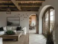
A warm greige acts like a gentle exhale for a busy household. It reads neutral but carries subtle warmth that flatters wood floors, woven rugs, and the varying tones of family photos. Visually, this shade unifies open-plan spaces—kitchen, dining, and living—so transitions feel seamless and intentional instead of choppy. Emotionally, it provides a calming backdrop for the chaos of morning routines and homework sessions, offering a quiet stage that doesn’t compete with toys or artwork.
To apply it at home, paint all main living areas in a single greige formula and layer color with textiles: throw blankets, curtains, and accent pillows. Keep trim a crisp off‑white to frame windows and architectural details. As an interior styling tip, add a few warm metallics or natural woods to prevent the palette from feeling flat. This approach makes it easy to change accent colors seasonally or when a child’s taste evolves—no repainting required, just swap cushions and art.
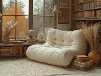
Serene Bedroom Blues and Greens for Better Rest
Bedrooms benefit from paint that invites relaxation and slow mornings. Muted blues and soft sage greens slow the visual pace without feeling cold or infantilized. These tones help bedrooms feel like a sanctuary after school drop‑offs and weekend sleepovers, contributing to better sleep and calmer evening routines. They also pair effortlessly with linen textures and layered lighting, making bedtime rituals feel luxurious yet practical.
To use these hues, choose a slightly desaturated blue for the master or a soft green for kids’ rooms. Keep ceilings and closets neutral to avoid overwhelming small spaces. Add personal touches—photo collages, a favorite quilt, or floating shelves with treasured finds—to keep rooms feeling lived‑in and loved. For an interior styling tip, pick bedding with subtle patterns that echo the wall tone; that repetition helps tie together décor while still allowing toys and school projects to shine without clashing.
Earthy Accent Rooms: Terracotta, Mustard, and Warm Clay
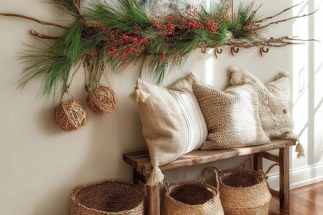
Accent rooms—think powder rooms, mudrooms, or a breakfast nook—are perfect places to embrace richer, trend-forward hues like terracotta or warm mustard. These colors bring warmth and personality, creating pockets of energy that lift daily routines like packing lunches or coming home from practice. They also photograph well for family snapshots and make small spaces feel intentional rather than afterthoughts.
Start by choosing one or two rooms to accent and commit to a saturated tone on three walls or just the focal wall behind a mirror or bench. Pair these colors with matte finishes and natural textures—rattan baskets for shoes, a wooden bench with cubbies, or a pendant light above the nook. A small investment in paint yields big visual payoff and allows the rest of the home to remain understated. This strategy supports decorating inspiration by giving you high-impact areas that express personality while keeping main zones versatile.
Playful Yet Practical Hues for Kid Zones
Kid areas need color that can take a beating and still look intentional. Chalky, muted versions of primary colors—soft navy, chalkboard green, or dusty coral—offer playfulness without chaos. These shades stimulate creativity but are forgiving: smudges blend in, and touch‑ups are easier because the tones aren’t too bright or saturated. Emotionally, they create spaces where kids feel safe to experiment and display art, making those messy afternoons feel purposeful.
Apply these paints to a playroom, craft wall, or a feature stripe in a hallway where backpacks hang. Use washable, durable finishes for lower wall areas, and designate a small gallery wall where artwork can be rotated. Incorporate child‑friendly storage solutions that match the palette so cleanup becomes part of the routine—baskets and labeled bins in complementary hues keep things tidy without sacrificing style. These interior styling tips help rooms stay stylish for parents and fun for kids.
Trim & Door Drama: Dark Accents for Modern Contrast
Adding dark trim or painted doors elevates an entire palette without repainting every wall. Charcoal, deep green, or near‑black on doors, window frames, and baseboards creates a crisp, modern contrast that highlights architectural details. This approach works especially well in family homes because trims and doors are less likely to need frequent repainting than whole walls, offering longevity and a designer touch that withstands changing trends.
To do this at home, choose a low‑sheen finish on trims to reduce scuff visibility and select a coordinated main wall color that shares undertones with the dark accent. For practical application, focus on high-impact elements—front door, pantry door, or stair balustrade—so the effect feels intentional. The result reads polished and collected, like the house was styled steadily over time. It’s an easy interior styling tip that photographers and neighbors notice, making everyday moments—welcoming guests, running after the mail—feel a little more special.
Cohesive Flow: Matching Undertones Across Rooms
A whole‑home palette feels intentional when undertones are consistent. Cool greys with blue undertones can clash next to warm beiges; instead, map your home by choosing a primary undertone—warm, cool, or neutral—and select each room’s color to harmonize with it. This technique creates visual continuity that’s forgiving when furniture moves rooms or when kids rearrange toys and books.
Practically, sample paint swatches in each room during different times of day to see how daylight and lamp light shift color. Use a unifying element—like the same off‑white trim or repeated brass fixture—to anchor varied hues. For families, this reduces repainting stress because each space reads as part of a greater story rather than a collection of competing choices. These home décor ideas and interior styling tips help create a home that flows from the mudroom to the master suite, making everyday routines more peaceful and visually satisfying.
Conclusion
If you’re gathering decorating inspiration for a full repaint or a few targeted updates, think about a palette that honors daily life—durable finishes, cohesive undertones, and a mix of calm and cheerful rooms. Save this page for when you’re standing in the paint aisle with two kids asking to pick “one color,” and remember small changes like painted doors or a warm greige can make a big difference. For a ready-made option and more curated whole‑home color guidance, check out this Curated Modern Boho Whole Home Color Palette Guide on Etsy that can help you choose a cohesive scheme for every room. Come back when you’re ready to tackle the next wall—your home is a living scrapbook, and paint is one of the easiest ways to tell your family’s story.