


I still remember the spring our youngest learned to ride a bike without training wheels. It was dusk, the neighborhood kids cheering from driveways, while I juggled dinner, a load of laundry, and the endless paper trail of school permission slips. My house felt like a scrapbook of those small, bright moments: crayon marks on the breakfast table, soccer cleats by the door, and a favorite cardigan draped over the couch. Creating a calm, welcoming space for our busy family became my way to catch my breath. Over time I realized that the right paint palette could do more than look pretty. It could soften mornings, make homework corners feel like havens, and hold up to sticky hands and neighborhood potlucks. If you love practical home décor ideas that balance timeless style with modern life, start with a color story that grows with your family. For kitchen refresh ideas, I often refer to timeless warm white kitchen ideas for real-life inspiration.
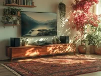
Palette 1: Timeless Warm Neutrals
A warm neutral base gives a whole house a cohesive, lived-in feel that stands up to trends. Think soft creams, warm greige, and muted taupe for walls; layer with white trim and natural wood tones. Why it works: neutrals reflect light and provide a forgiving backdrop for kids artwork, changing furniture, and seasonal accents. How to apply: paint main living areas in a single warm neutral, then use slightly lighter tones in hallways and a deeper neutral in the dining area for subtle depth. Add washable finishes in high-traffic zones to handle spills and fingerprints. Lifestyle note: my kids’ homework station sits against a neutral wall with a magnetic board for art and reminders, so the space feels calm while still showing family life. These interior styling tips are great for renters and homeowners alike.
Palette 2: Cozy Blues with Cream Accents
Blue is versatile and calming, making it ideal for whole-house palettes that aim for both trend and timelessness. Choose mid-toned blues for a living room or open-plan space, and balance with cream cabinetry or trim. Why it works: blue has a natural ability to soothe after a hectic day, while cream accents keep the palette warm and welcoming. How to apply: use blue on a focal wall or across connected living spaces, then pick cream or off-white for kitchens and bathrooms to maintain continuity. Add brass or matte black hardware to modernize the look. Lifestyle note: a shared family reading nook painted in a soft blue becomes a magnet for nightly story time and lazy weekend mornings, blending decorating inspiration with practical family living.
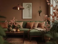
Palette 3: Soft Greens and Natural Wood
Soft sage or muted olive pairs beautifully with unvarnished or lightly stained wood for a grounded, nature-inspired home. Why it works: green evokes outdoor calm and complements houseplants, woven baskets, and wooden furniture for an everyday, relaxed aesthetic. How to apply: choose a soft green for entryways and bedrooms, then repeat the hue in accents like built-in bookcases or kitchen islands. Finish with white ceilings to keep rooms bright. Lifestyle note: our backyard herb shelf looks right at home against a sage wall, and the kids love picking sprigs for family dinners. This approach to home décor ideas brings a fresh, lived-in quality without feeling fussy.
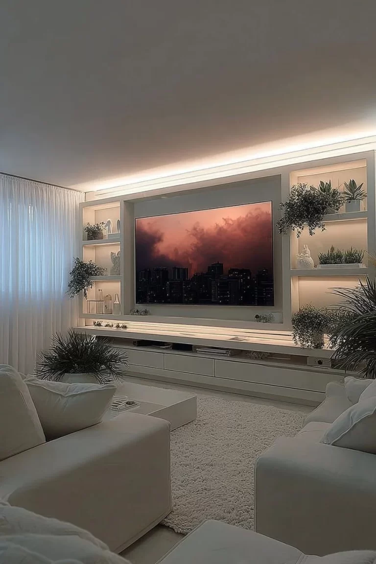
Palette 4: Warm Grays with Colorful Accents
Warm gray walls create a neutral canvas that welcomes pops of color—think mustard pillows, teal art, or coral ceramics. Why it works: warm gray is forgiving with light changes and pairs with most furniture styles, making it a smart choice for whole-house continuity. How to apply: paint main areas in a warm gray, reserve a richer shade for an accent wall, and use vivid accessories to inject personality. Consider matte or eggshell finishes in living areas and semi-gloss for trim to aid cleaning. Lifestyle note: our hallway gallery against a warm gray wall showcases rotating kids’ projects and neighborhood snapshots, so the space feels personal and easy to update. For craft-based accents, try ideas like hand-painted wood slice ornaments to add handmade charm.
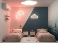
Palette 5: Sunlit Pastels with Neutral Grounding
Subtle pastels like blush, pale peach, or soft lavender can warm a house without feeling juvenile when grounded by warm neutrals and textured fabrics. Why it works: pastels soften sharp corners and catch light in pleasing ways, creating cozy, optimistic rooms. How to apply: use pastels sparingly on bedroom walls or smaller rooms, then tie them across the home with neutral rugs, woven throws, and natural fiber shades. Keep cabinetry and baseboards in neutral tones to balance the palette. Lifestyle note: my daughter’s art projects pop against a pale peach wall, while parents appreciate that gentle hues still work for adult spaces. These decorating inspiration choices make each room feel intentional and restful.
Palette 6: High-Contrast with Warm Wood and Soft Metals
A high-contrast palette uses deep charcoal or navy paired with crisp white, then softened by warm wood and brushed metals. Why it works: contrast creates a modern, curated look that reads as both trendy and classic when paired with natural materials. How to apply: choose a dark hue for a focal wall or kitchen island, paint surrounding walls white, and introduce wood floors or shelving for warmth. Use soft gold or aged brass fixtures to bring a cozy, family-friendly touch. Lifestyle note: for our weekend pancake mornings, the dark island hides mess and the white surrounding surfaces keep the room bright, so style meets real-life functionality. This blend of interior styling tips keeps a home polished yet practical.
Conclusion
Choosing a whole-house paint strategy is one of the most effective home décor ideas for lasting style and daily comfort. Save these palettes, try one room first, and let the colors evolve with your family’s routines and memories. For curated color pairings and professional palettes that help you plan a cohesive look, explore the Color Collections | HGTV Home® by Sherwin-Williams to find combinations that match your vision. If a palette feels right, revisit and refine it over time to keep your home both timeless and full of life.
0 Comments